Google Adsense provides content publishers with various Ad types, sizes and formats that can be used for their Ad slots to make ADs blend in well within website layout or theme. An important step in that configuration is selecting a right Ad Size, because there are few AD sizes that really performs very well and also these sizes naturally fits in with the site making it appealing for the visitors, thus bringing a better click through rate.
For fixed layout websites, selecting a best size is easy based on trial and response method. But for a responsive website, selecting different Ad sizes for various device screen widths is a real pain. So to avoid this manual decision on best size & AD performance, Google Adsense has introduced Responsive Ad units.
How it works ?
When page is loaded, these responsive Ad Units reads the parent container’s dimensions for available space (width * height) and then based on that, it automatically shows the best AD size which fits exactly and performs better for that screen size. It is really cool feature that makes Adsense integration simpler on responsive sites. Responsive AD units can also be used on fixed website layouts without any issue as its display is based on parent container.
Problem with responsive layouts that toggles AD section visibility
When you have design requirement to show a responsive AD only on desktop views and hide it on mobile view due to space constraint. The display requirement directly conflicts with the Adsense Ad policy, because hiding an AD using display:none or using another HTML element is not allowed at anytime on your page.
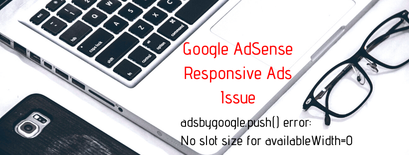
The responsive AD script will throw following error in developer console
Note: This error can happen when the parent container doesn’t have a width because
either it is hidden using display:none or
the parent element (div) has no dimension (i.e., width or height) because its CSS positioning is set as absolute, or float.
Officially allowed code modification
To tackle this trivial requirement, Google Adsense has allowed certain official modification to its Ad script through CSS3 media queries. The modifications are as follows
You cannot use the responsive AD display format control feature i.e., you should remove the advance AD attribute `data-ad-format`. [This tag is for controlling the AD display i.e., Whether to display vertical, horizontal or rectangle ADs on the slot]
Add a CSS class name (selector e.g., right_side_ad) to the AD insertion ins tag.
Then in the CSS (style tag), add media queries for your AD unit selector specifying the breakpoints when the AD should display and it shouldn’t. Also specify the width and height if the AD is within an absolute parent.
Here is the Adsense script and CSS that is currently being used by the right side Ad in this website., provided below for your reference
<!– index.html –>
<div class=”push-rightbar”>
…. content …
<div align=”center” class=”push-rightbar-holder”>
<!– RightBar_Unit –>
<ins class=”adsbygoogle rightbar-unit”
data-ad-client=”ca-pub-XXXXXXXXXXXXXXXXX”
data-ad-slot=”YYYYYYYYYY”></ins>
<script>
(adsbygoogle = window.adsbygoogle || []).push({});
</script>
</div>
</div>
/* style.scss */
$rightbar-lg-adsize: 160px;
$rightbar-xllg-adsize: 300px;
$rightbar-lg-adsize-gutter: $rightbar-lg-adsize + $grid-gutter-width;
$rightbar-xllg-adsize-gutter: $rightbar-xllg-adsize + $grid-gutter-width;
.push-rightbar {
position: relative;
@media(min-width:$screen-lg-min) {
padding-right: $rightbar-lg-adsize-gutter;
}
@media(min-width:$screen-xllg-min) {
padding-right: $rightbar-xllg-adsize-gutter;
}
&-holder {
display: none;
position: absolute;
right: 0;
top: 0;
bottom: 0;
padding: $gutter-half;
width: $rightbar-lg-adsize-gutter;
@media(min-width:$screen-lg-min) {
display: block;
}
@media(min-width:$screen-xllg-min) {
width: $rightbar-xllg-adsize-gutter;
}
.rightbar-unit {
display: block;
width: $rightbar-lg-adsize;
min-height: 600px;
@media(max-width:$screen-md-max) {
display: none;
}
@media(min-width:$screen-xllg-min) {
width: $rightbar-xllg-adsize;
}
}
}
}
plain CSS
.push-rightbar {
position: relative
}
.push-rightbar-holder {
display: none;
position: absolute;
right: 0;
top: 0;
bottom: 0;
padding: 15px;
width: 190px
}
@media (min-width: 1200px) {
.push-rightbar {
padding-right: 190px
}
.push-rightbar-holder {
display: block
}
}
@media (min-width: 1366px) {
.push-rightbar {
padding-right: 330px
}
.push-rightbar-holder {
width: 330px
}
}
.push-rightbar-holder .rightbar-unit {
display: block;
width: 160px;
min-height: 600px
}
@media (max-width: 1199px) {
.push-rightbar-holder .rightbar-unit {
display: none
}
}
@media (min-width: 1366px) {
.push-rightbar-holder .rightbar-unit {
width: 300px
}
}

